Designers, printers, and creators live by the Pantone swatch book. But for the everyday consumer, Pantone is an abstract concept—a cultural touchstone they admire but rarely interact with directly. We needed to bridge the gap between industry tool and consumer lifestyle, transforming the world's most famous color system into a tangible, personal experience.
PANTONE’S WEARABLE SWATCHES
Art Director: Abby Pallant
The Problem: Pantone is the undisputed global authority on color, but their primary audience is purely B2B (designers, printers, manufacturers). While they generate consumer hype (like with "Color of the Year"), they rely entirely on third-party collaborations to monetize it.
The Insight: People don't just want to see Pantone colors, they want to wear them. The iconic Pantone fan deck is a symbol of creative identity, but everyday consumers have no reason to own one.
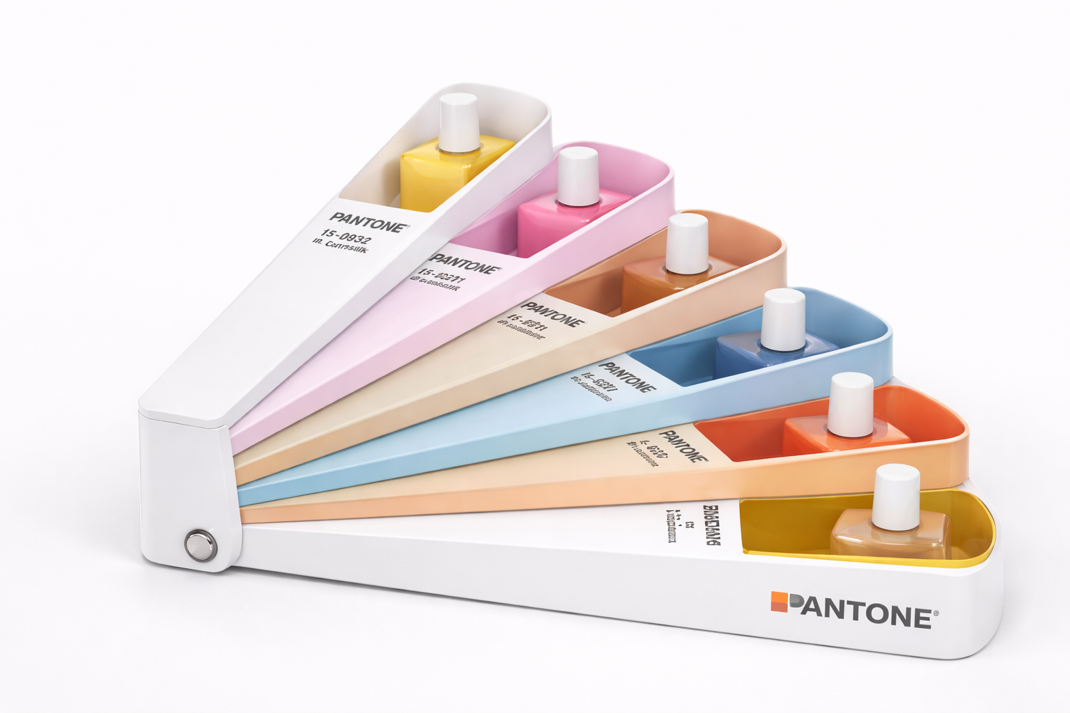
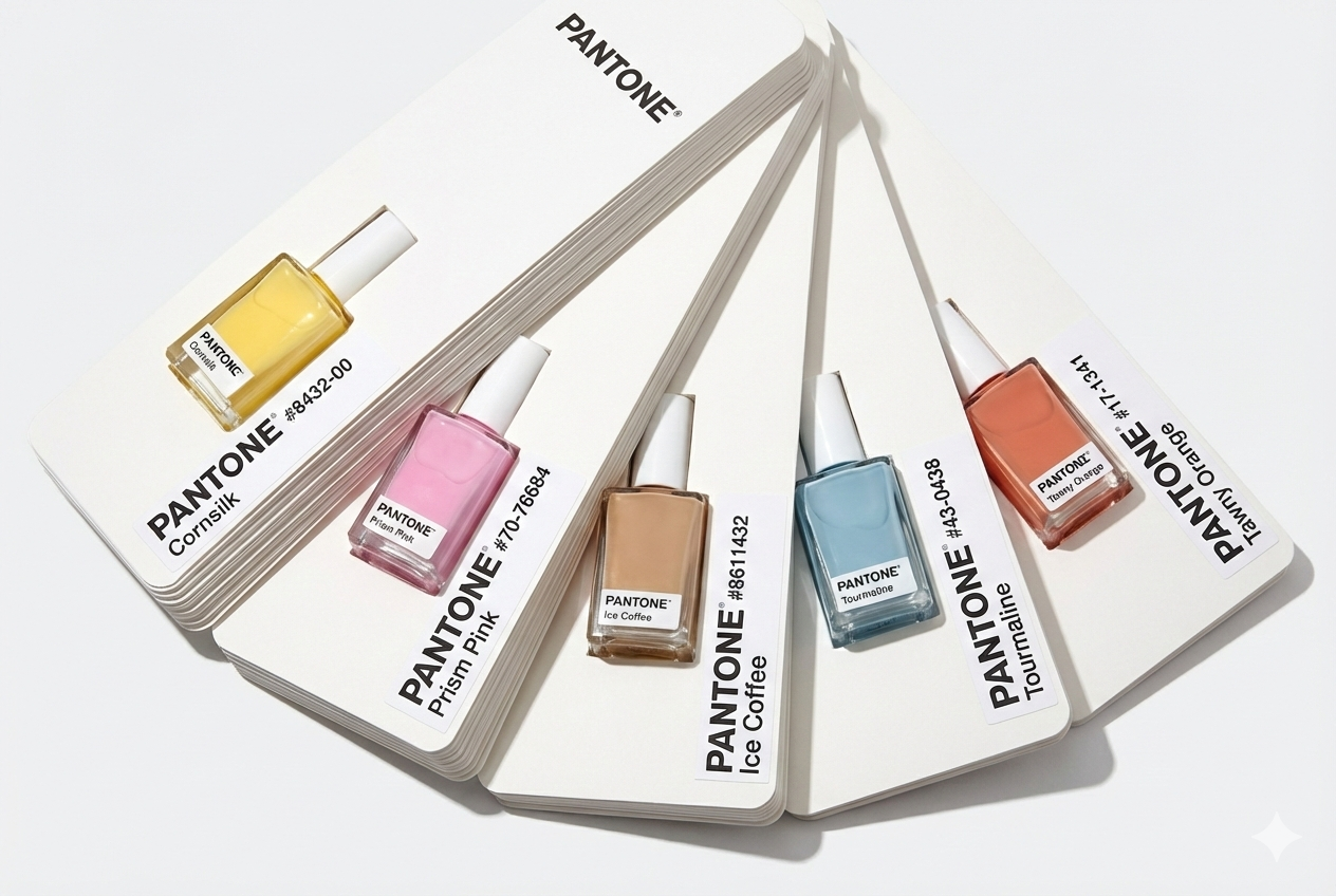
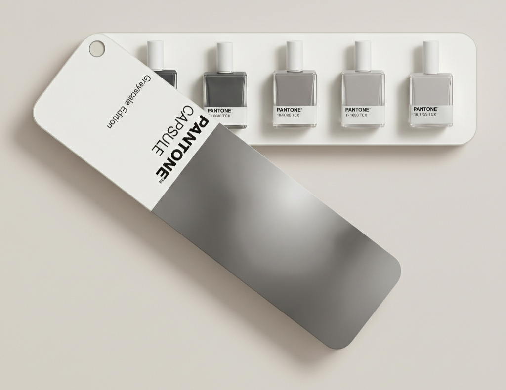
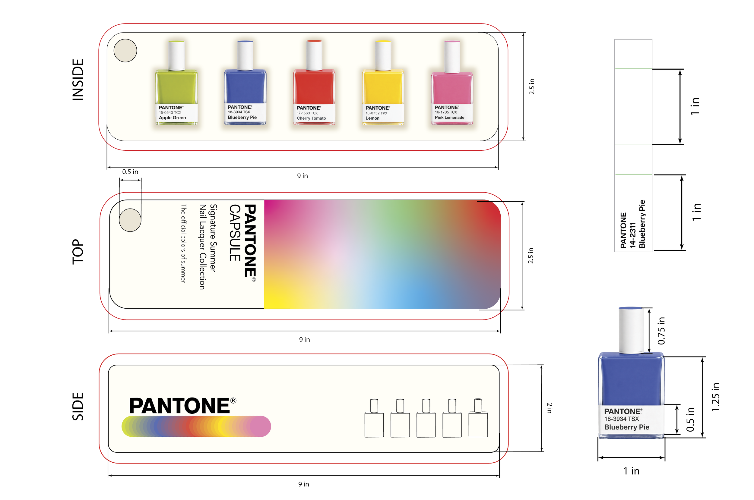
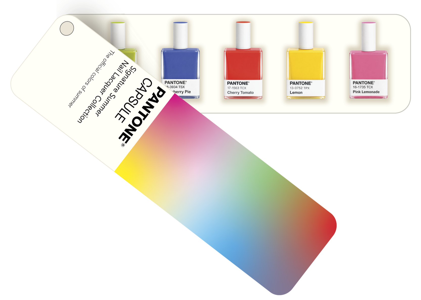
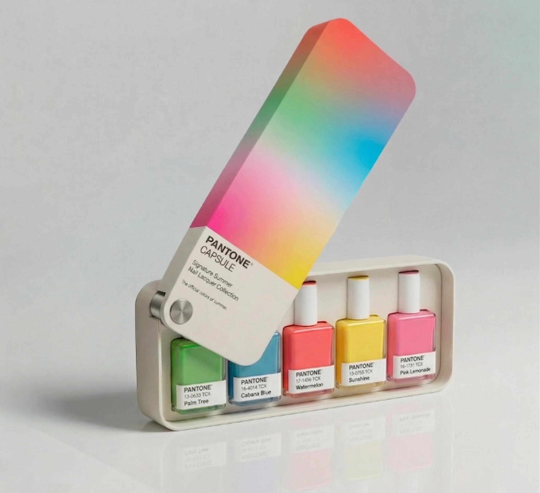
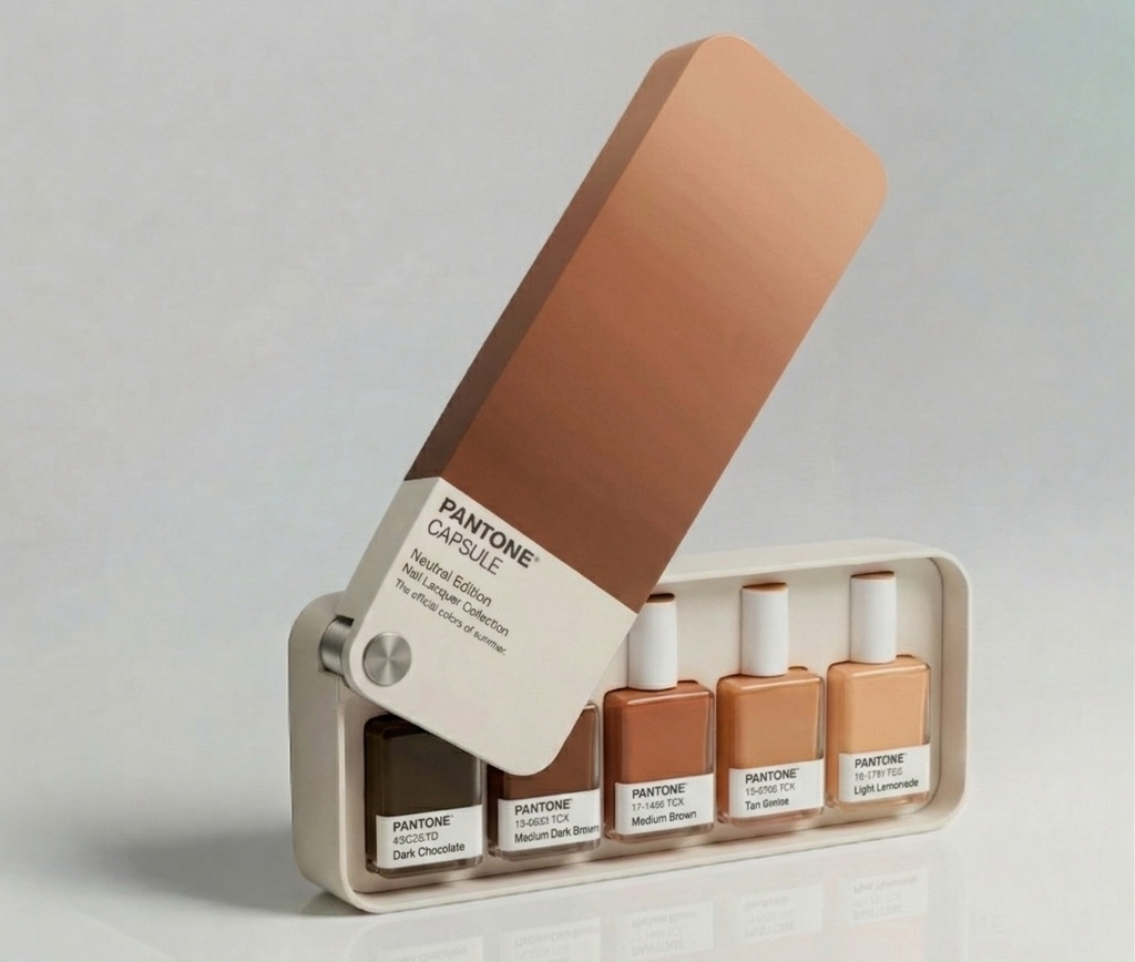
The Solution: I turned the ultimate designer’s tool into a beauty staple. By translating the iconic, functional design of the Pantone formula guide into a premium nail lacquer collection, we gave color enthusiasts a way to literally wear the brand's exact specifications. It’s not just a beauty product; it’s a wearable swatch book.
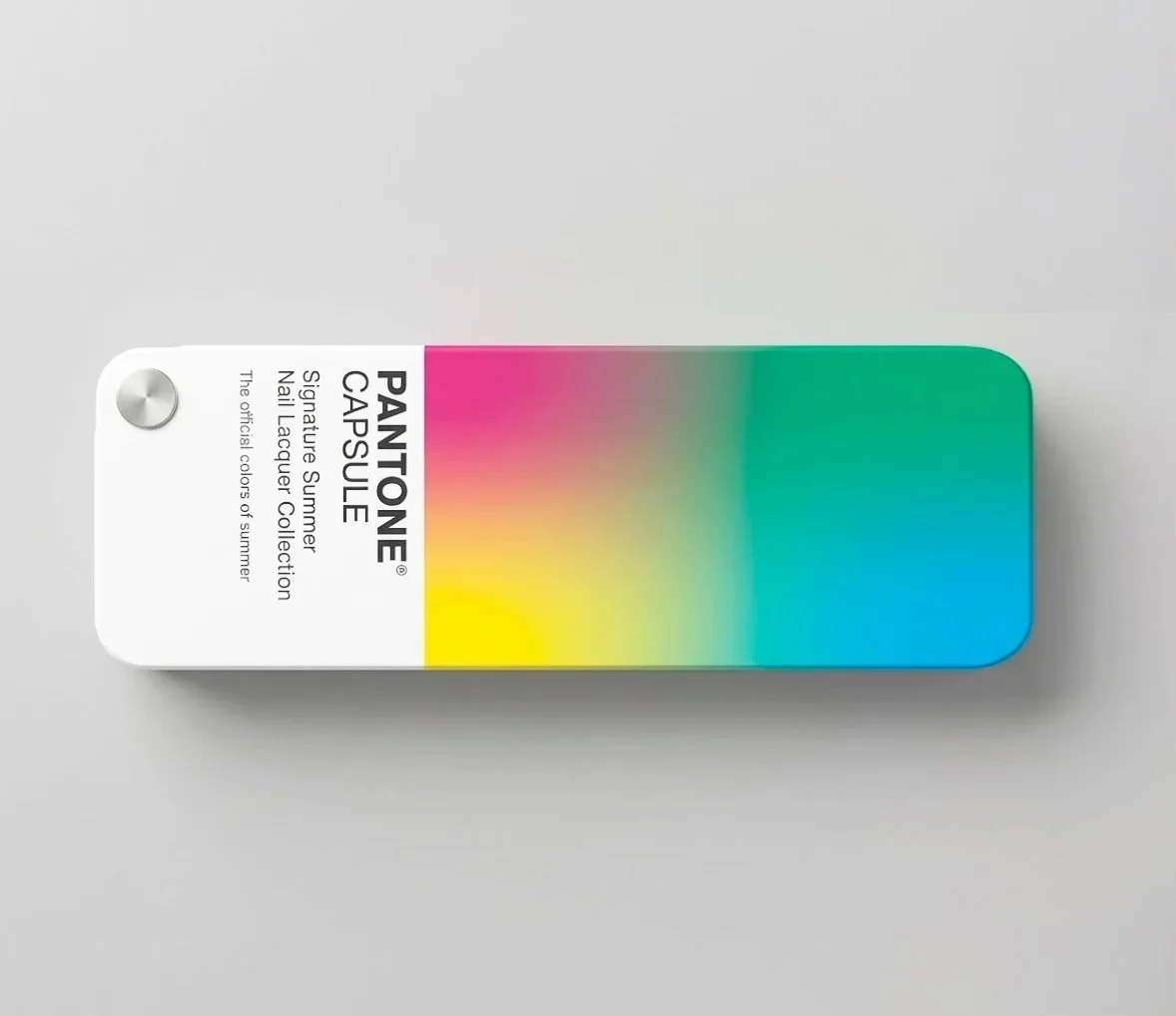
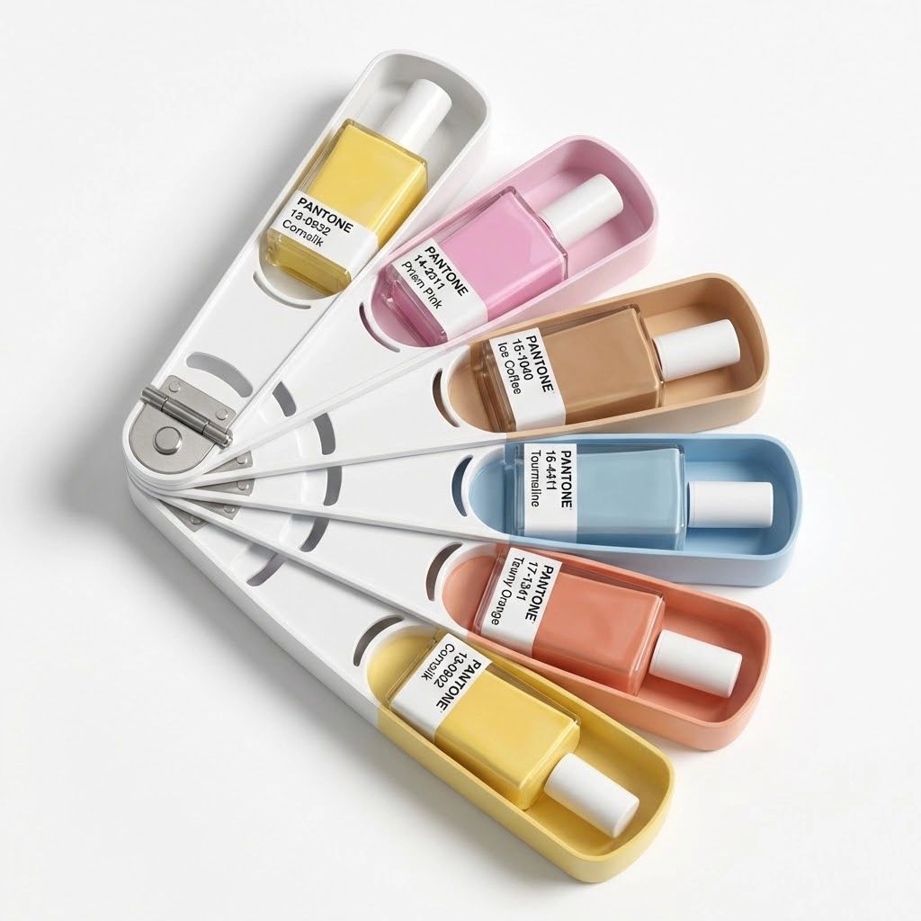
The Design: The packaging was engineered to mimic the exact physical experience of a Pantone deck. Instead of a traditional lift-off lid, the box is anchored by a single corner pivot, allowing the consumer to "fan out" the palette just like a designer searching for the perfect shade.
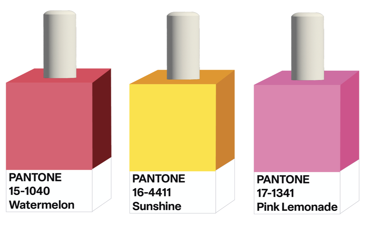
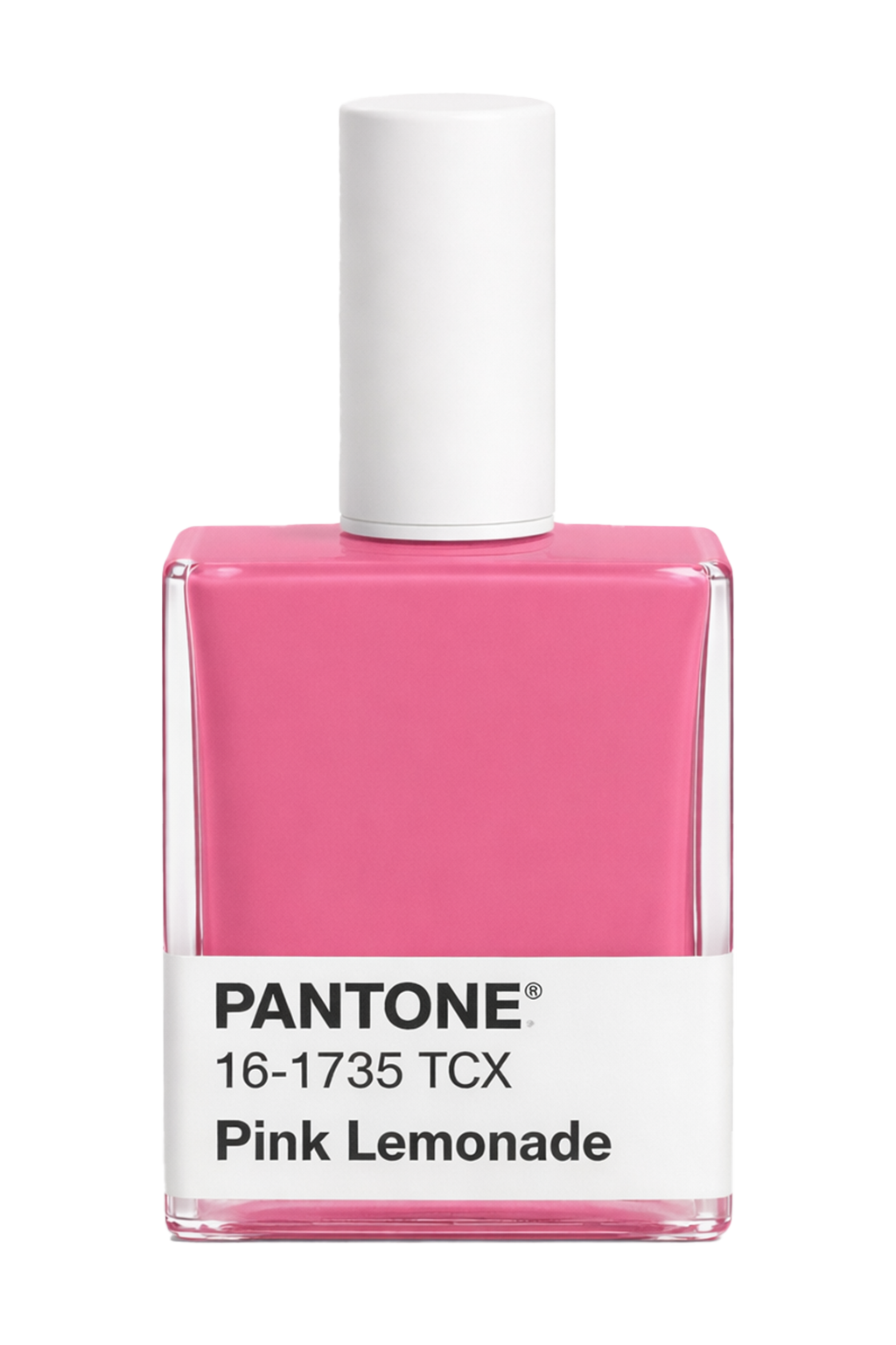
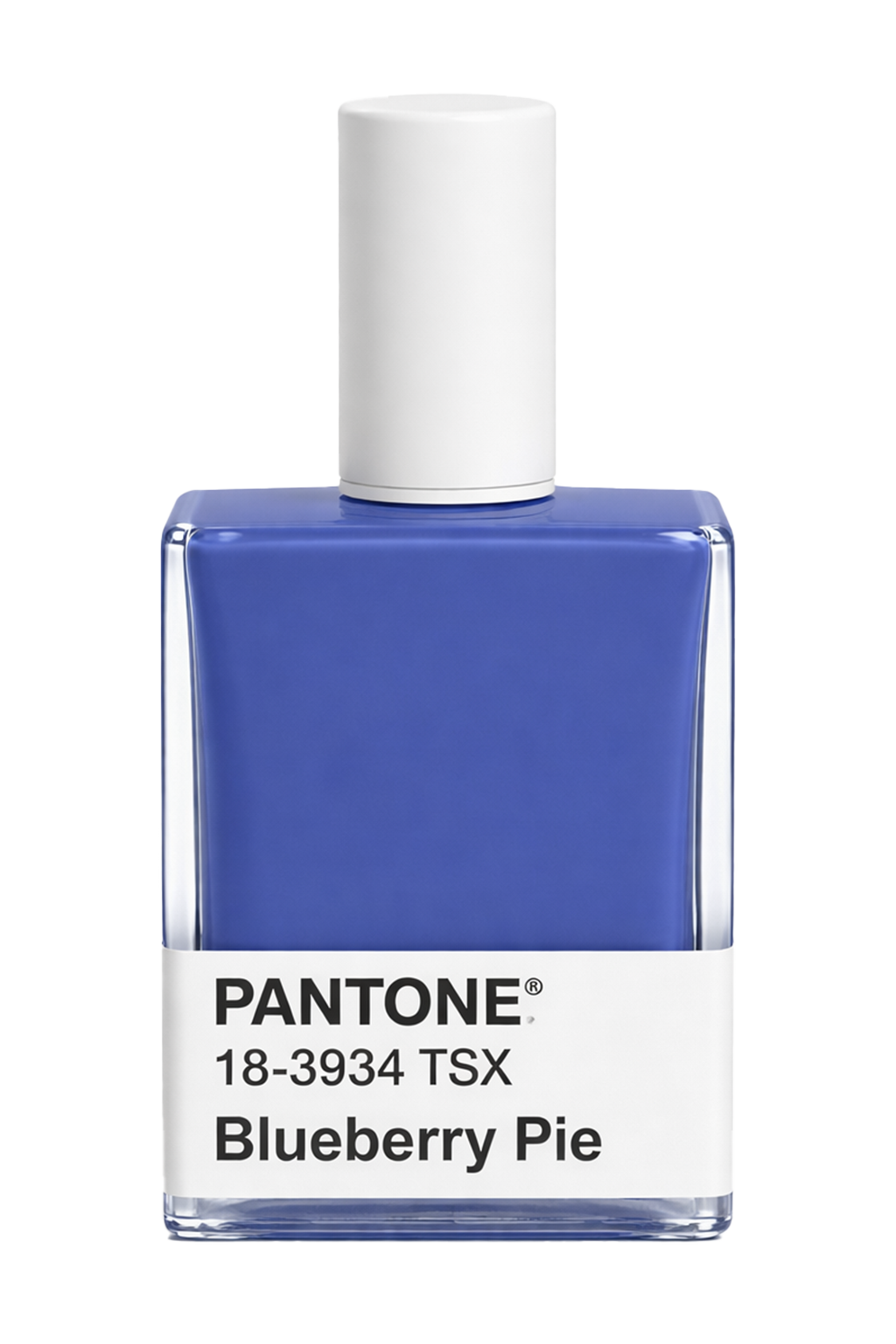
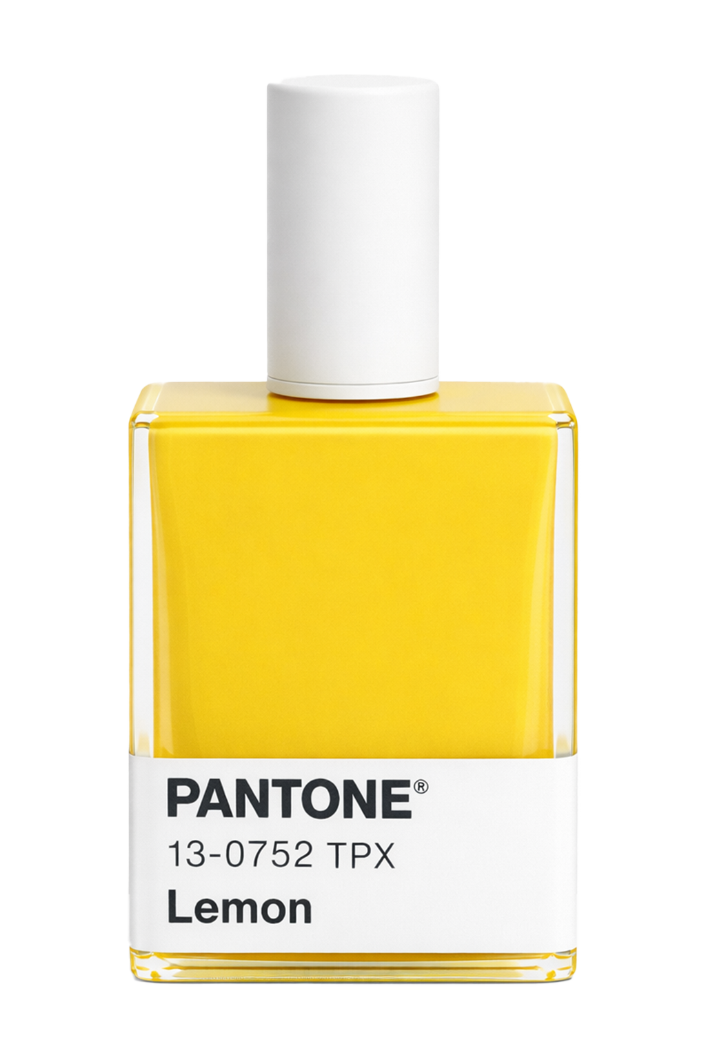
The Identity: We maintained Pantone's strict, minimalist brand standards. The heavy use of negative white space and precise typography transforms each individual lacquer bottle into a physical, 3D Pantone chip.
The Personality: Abandoning the subjective, fluffy names of the beauty industry, each bottle is labeled strictly with its official Pantone TCX code, bringing a professional level of exactness to consumers.
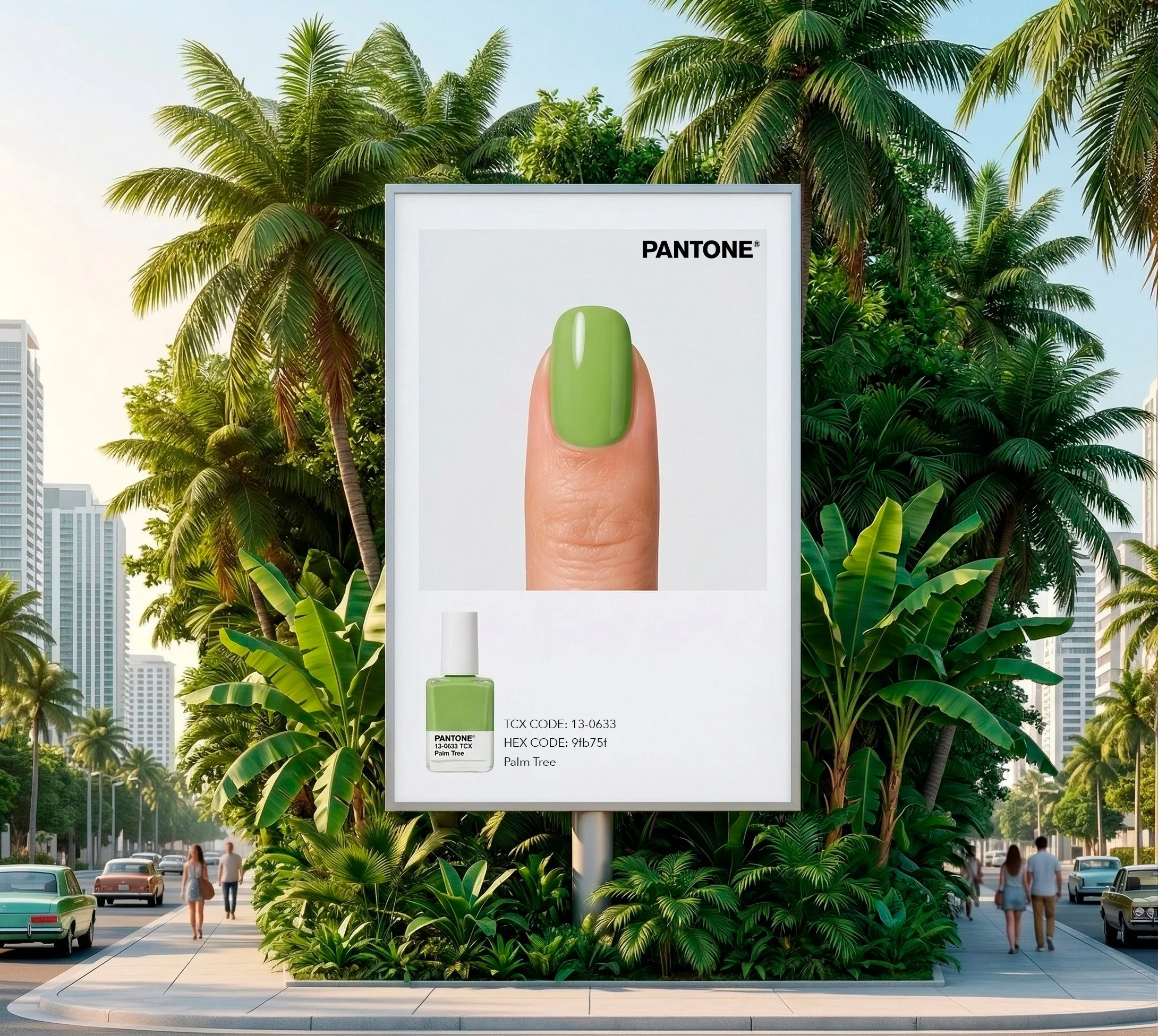
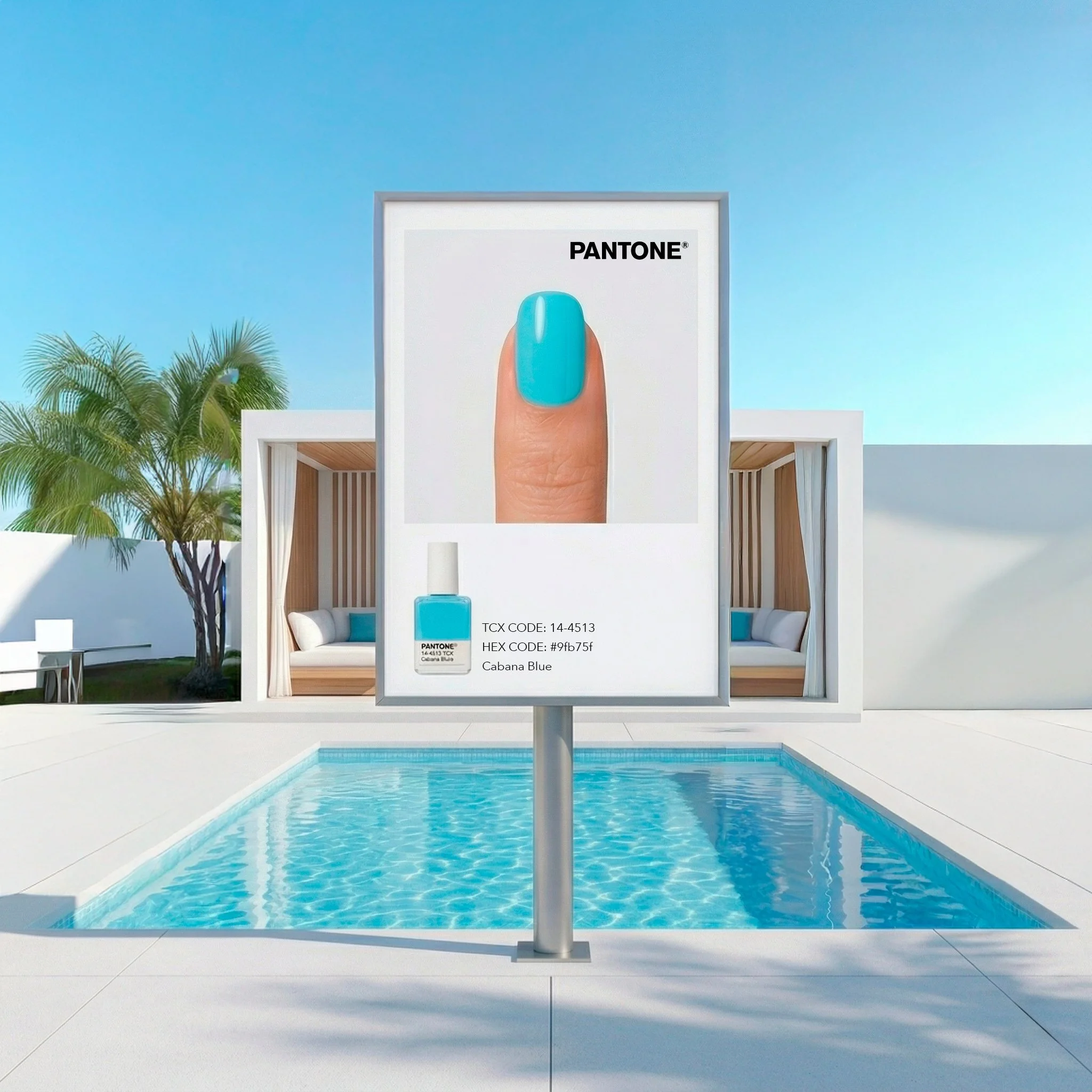
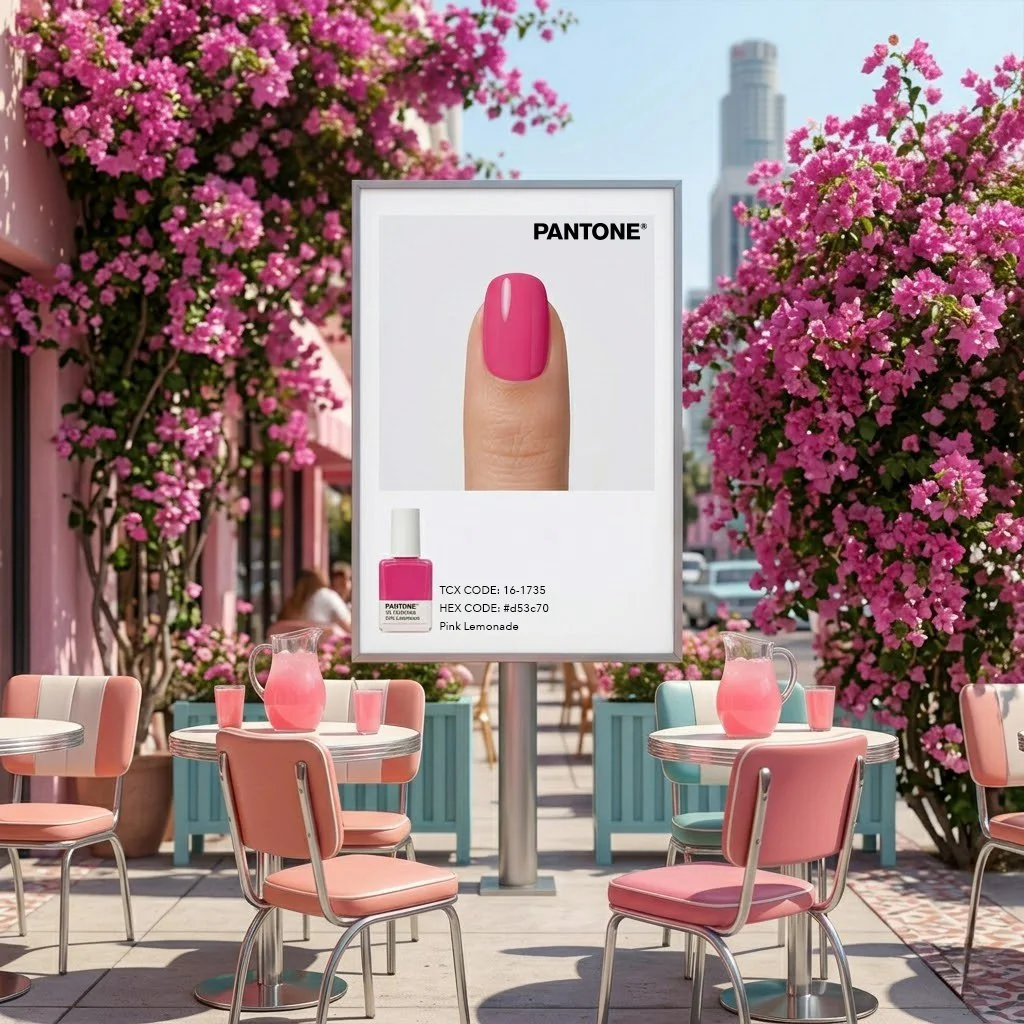
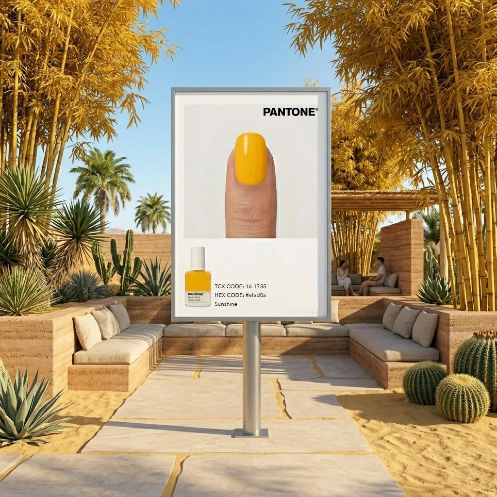
Our OOH strategy strips away headlines and lifestyle photography, leaving only the product and its exact Pantone code. By placing these minimalist boards contextually against their real-world inspirations, the surrounding environment does the talking, transforming spaces into live Pantone swatches.
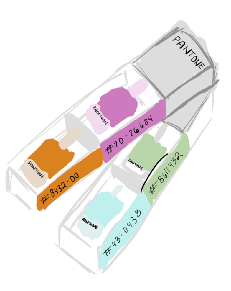
My process started with rough sketches to figure out how to make this feel authentically Pantone. I realized the packaging needed to physically fan out, exactly like their traditional swatch books.
From there, I translated those doodles into simple illustrator vectors. I then worked tiredly with all types of ai image generators to produce different packagings. I engineered a single-corner pivot instead of a standard lift-off lid.
Finally, applying the signature gradients and typography brought the whole vision to life.